
Nieuws
Ontvang inzichten in de nieuwste ontwikkelingen binnen intellectueel eigendom, uitnodigingen voor evenementen en relevante updates. Abonneer u op onze nieuwsbrief Perspectives.
Zoekopdracht
- Artikel
- Blog
- Webinar
- Whitepaper
- Klantervaring
- Evenement
BRONNEN (535)
 Wanneer wordt een bewegingsmerk geweigerd wegens technische functionaliteit?Merken en modellenHet Gerecht van de EU weigerde een bewegingsmerk voor een openklappend raam omdat de beweging een technisch proces vormde. Wanneer verhindert de techniekexceptie de registratie van een merk?Lees nu
 George Orwell als merk? EUIPO zegt neeMerken en modellenDe Uitgebreide Kamer van Beroep van het EUIPO heeft bevestigd dat de naam GEORGE ORWELL niet als EU-merk kan worden geregistreerd voor onder meer media- en educatieve diensten. De uitspraak verduideli...Lees nu
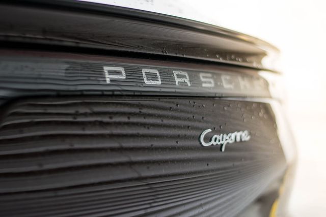 CAYENNE / LITTLE CAYENNE: een rem op de reikwijdte van de reputatie van een merkMerken en modellenEen Franse uitspraak over CAYENNE en LITTLE CAYENNE laat zien dat zelfs bekende merken niet automatisch bescherming genieten buiten hun eigen productcategorie. Wanneer kan een merkhouder optreden tege...Lees nu
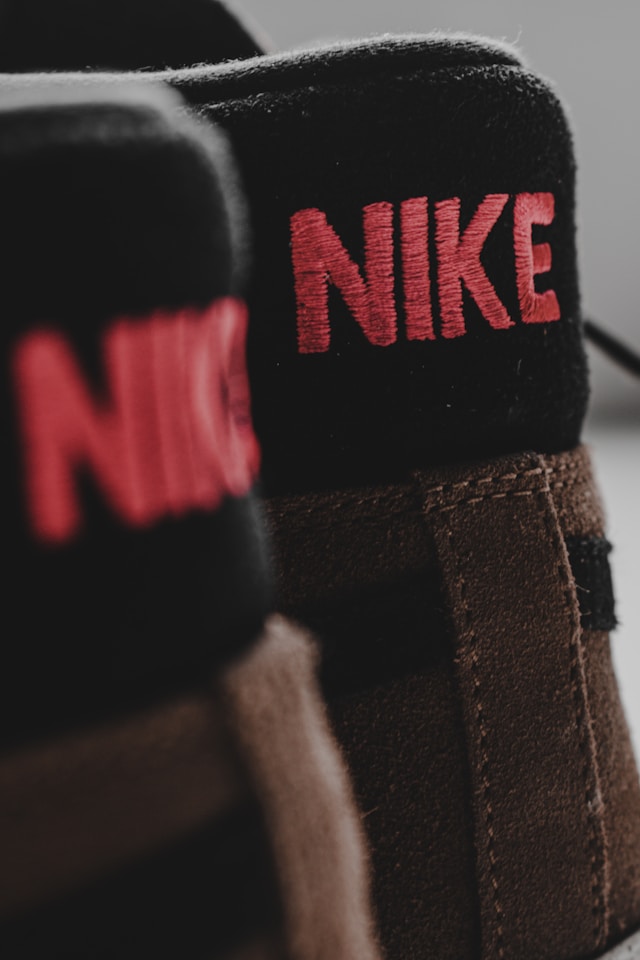 Nike Total 90: merkenconflict na vervallen merkregistratieMerken en modellenNike wilde zijn iconische voetballijn Total 90 nieuw leven inblazen, maar ontdekte dat de merkregistratie inmiddels door een ander was vastgelegd. De zaak laat zien welke risico’s ontstaan wanneer een...Lees nu
 Kruidenmeisje versus Spice GirlsMerken en modellenEen jonge Canadese ondernemer bouwde haar kruidenmerk SPYCE GIRLZ uit tot een succes, totdat de Spice Girls oppositie indienden tegen haar merkaanvraag. De zaak laat zien hoe riskant het is om aan te ...Lees nu
 Van olympisch goud naar merkbescherming: de naam Johannes Høsflot Klæbo als commercieel merkMerken en modellenOlympisch kampioen Johannes Høsflot Klæbo bouwt niet alleen aan sportieve successen, maar ook aan zijn naam als merk. Wat gebeurt er wanneer een fanclub een bijna identieke merknaam registreert? Een a...Lees nu
 De Super Bowl, de Olympische Spelen en het WK: hoe scoor je zonder inbreuk te maken op handelsmerken?Merken en modellenGrote sportevenementen zoals de Super Bowl, de Olympische Spelen en het WK Voetbal bieden enorme marketingkansen. Maar hoe voorkomt u merkinbreuk of beschuldigingen van ambush marketing wanneer u op d...Lees nu
 Auteursrecht op verpakkingen: wat Benelux-bedrijven kunnen leren van een champagnezaakMerken en modellenEen Franse uitspraak over champagne-etiketten benadrukt dat het gebruik van kunstwerken op verpakkingen niet zonder risico is. Zonder duidelijke afspraken over auteursrechten kan commercieel gebruik v...Lees nu
 Kleurmerken: een minder vaak voorkomende maar gewilde vorm van bescherming in de EUNa de afwijzing van een aanvraag voor een kleurmerk door het Duitse bouwbedrijf Weischer GmbH, geeft Colombe Dougnac advies over hoe een onderscheidend karakter te creëren bij aanvragen voor kleurmerk...Lees nu
 Hoe om te gaan met kostenbeslissingen van BOIP en EUIPOMerken en modellenHoe om te gaan met kostenveroordelingen bij beslissingen van EUIPO en BOIP in oppositieprocedures en nietigheidsprocedures van merken.Lees nu
 Merkbescherming en marketingtrends: de zaak ‘Quiet Luxury’Commerciële concepten zoals ‘quiet luxury’ spreken sterk tot de verbeelding van het publiek, maar dat betekent nog niet dat ze ook als merk kunnen worden geregistreerd.Lees nu
 Parallelimport en de uitputtingsleer: bescherming en begrenzing van het merkrechtMerken en modellenVoor merkeigenaren is controle over distributie, prijsstelling en merkreputatie essentieel. Parallelhandel – en in het bijzonder parallelimport – kan die controle onder druk zetten. In dit artikel lic...Lees nu
 Een stem als merk: legt Mcconaughey AI het zwijgen op?Merken en modellenDe registratie van de iconische uitspraak “Alright, alright, alright” als geluidsmerk door Matthew McConaughey roept een fundamentele vraag op: kan het merkenrecht effectieve bescherming bieden tegen ...Lees nu
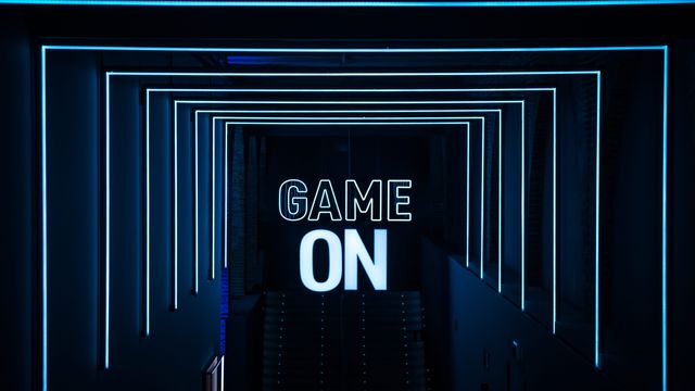 IE voor de gamingsector: een praktische gidsMerken en modellenBij de ontwikkeling van videogames wordt intellectueel eigendom (IE) vaak onderschat. IE is essentieel om creatieve ideeën te beschermen en commerciële waarde veilig te stellen. Zonder goede IE-strat...Lees nu
- BlogVan schrijven naar sneller beslissenMerken en modellenOnze merkgemachtigden volgden een schrijftraining om IP-advies duidelijker, sneller en beslisbaar te maken. Zo profiteer jij van heldere communicatie en betere IP-beslissingen.Lees nu
 ChatGPT Checkout: wat merkhouders nú moeten doenChatGPT Instant Checkout verandert online commerce. Ontdek hoe merkhouders hun merkbescherming, anti-namaak en GEO-strategie moeten aanpassen voor het AI-tijdperk.Lees nu
 Het einde van de overgangsperiode voor UK-registraties die van EU-registratie zijn afgesplitstMerken en modellenMet het aflopen van de overgangsperiode voor door Brexit ‘gekloneerde’ merken in zicht, lopen gekloneerde Britse merken het risico te worden doorgehaald wegens niet-gebruik.Lees nu
 WhitepaperInternationaal uitbreiden: Zo benut u intellectueel eigendom voor groeiOntdek in onze whitepaper hoe u intellectueel eigendom effectief inzet als groeimotor voor uw internationale expansie.Nu downloaden
 FAQ AuteursrechtAuteursrechtHet auteursrecht beschermt een breed scala aan creaties (variërend van romans tot choreografieën en computerprogramma's), op voorwaarde dat deze werken origineel zijn en op een of andere manier tot ui...Lees nu
![[Webinar] Internationaal uitbreiden? Ontdek live hoe u met een sterke IE-aanpak uw internationale groei veiligstelt](https://novagraaf-staging.s3.eu-west-3.amazonaws.com/small_image_7a2879f56f.png) Webinar[Webinar] Internationaal uitbreiden? Ontdek live hoe u met een sterke IE-aanpak uw internationale groei veiligsteltOntdek in ons live webinar hoe u met een effectieve intellectueel eigendoms-aanpak uw commerciële groei over de grens veiligstelt.Bekijk nu
Webinar[Webinar] Internationaal uitbreiden? Ontdek live hoe u met een sterke IE-aanpak uw internationale groei veiligsteltOntdek in ons live webinar hoe u met een effectieve intellectueel eigendoms-aanpak uw commerciële groei over de grens veiligstelt.Bekijk nu


