- Trademarks & Designs
- Trademarks & Designs
- Strategy & managementUnlock the potential of your brand portfolio
- SearchingScreening and clearance search with smart pre-selection
- RegistrationTailored support to maximise your brand potential
- WatchingMonitor rights efficiently and cost-effectively worldwide
- Monitoring & prosecutionProtect and enforce rights on- and off-line
- Renewals & recordalsFlexible renewal and recordal services
- Strategy & management
- IP consultingBrand development, audits, licensing, M&A, valuation/monetisation, contract management and more
- IP consulting
- Patents
- Solutions
- Trademarks & Designs
- Trademarks & Designs
- Strategy & managementUnlock the potential of your brand portfolio
- SearchingScreening and clearance search with smart pre-selection
- RegistrationTailored support to maximise your brand potential
- WatchingMonitor rights efficiently and cost-effectively worldwide
- Monitoring & prosecutionProtect and enforce rights on- and off-line
- Renewals & recordalsFlexible renewal and recordal services
- Strategy & management
- IP consultingBrand development, audits, licensing, M&A, valuation/monetisation, contract management and more
- IP consulting
- Patents
- Solutions
- Contact
- About us
- About us
- About usProud to support iconic brands and innovative organisations worldwide
- Mission & visionDiscover how we are redefining IP management through dynamic, strategic and personalised services
- MilestonesExplore our history from our founding 135+ years ago to the present day
- Our offices18 offices and unique network of specialists delivers local expertise on a global scale
- Social responsibilityWe strive to positively impact the environment and the global community in which we work and live
- GovernanceInnovation, client focus and a passion for IP. Meet our management team
- About us
- Careers
- Log in
- About us
- About us
- About usProud to support iconic brands and innovative organisations worldwide
- Mission & visionDiscover how we are redefining IP management through dynamic, strategic and personalised services
- MilestonesExplore our history from our founding 135+ years ago to the present day
- Our offices18 offices and unique network of specialists delivers local expertise on a global scale
- Social responsibilityWe strive to positively impact the environment and the global community in which we work and live
- GovernanceInnovation, client focus and a passion for IP. Meet our management team
- About us
- Careers
- Log in

Glenfiddich vs Glenfield: battle of the label trademarks
The UKIPO made a somewhat unexpected decision in a recent dispute between two Scotch whisky brands. Distiller William Grant & Sons, owner of the Glenfiddich label trademark, has been unsuccessful in its opposition to the Glenfield label trademark application.
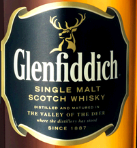
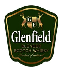
In 2018, Mumbai-based beverage company owner Vivek Anasane filed a UK application for the Glenfield label mark (see label below left) covering Scotch whisky. William Grant & Sons later opposed  the application on the basis of its earlier rights in the mark GLENFIDDICH (see label below right), on the basis of Section 5(2), 5(3) and 5(4)(a).
William Grant & Sons was not put to proof of use, but filed evidence in respect of the reputation and passing-off claims of the opposition. The evidence included information showing that the GLENFIDDICH mark has been used in the UK since the 1960s, with volumes between 2005 and 2014 in the region of 100,000 nine litre cases a year. Articles submitted showed a 30% market share of single malt whisky.
Assessing likelihood of confusion
On the likelihood of confusion ground, where the marks to be compared were the GLENFIELD label mark and the word mark GLENFIDDICH, the reasoning of the Hearing Officer is not surprising: the similarities between the marks are less pronounced than if two label marks were being compared.
However, the Hearing Officer did determine that the earlier GLENFIDDICH mark had high distinctive character given its long-standing reputation in the UK and beyond. Although, given that the Hearing Officer had determined that the marks shared only a low level of visual and conceptual similarity and low to medium aural similarities, he concluded that these factors outweighed some of the other similarities on a global comparison. The opposition under Section 5(2) therefore failed.
On the reputation ground of opposition under Section 5(3), while the earlier GLENFIDDICH mark was held to have a significant reputation for whisky products, the opposition failed again on the basis of the determined lack of similarity between the marks. As the Hearing Officer did not feel the marks were similar and had determined on likelihood of confusion that the GLENFIELD mark would not bring the opponent’s mark to mind, let alone confuse the consumer, there could be no required link and therefore no detriment or unfair advantage. The opposition under Section 5(3) therefore failed.
On the passing-off ground, again, the Hearing Officer confirmed that there was a long-standing and significant reputation in respect of the word mark GLENFIDDICH and that such use would lead to a conclusion that there is considerable goodwill. However, these statements did not extend to cover the label mark as well.
A problem of evidence?
The images of the Glenfiddich label represented in the opposition filing were very unclear and not filed in colour. The evidence filed showed that the label was used in a number of different variants. The Hearing Officer stated that it was not always clear to see the GLENFIDDICH wording prominently displayed, and that there were a range of light coloured labels, clear labels and colour schemes. However, the Hearing Officer did still determine that there was sufficient evidence to demonstrate goodwill in the label mark relied upon, but that this was less than the word mark, given the use of various labels and colour combinations.
On a comparison of the marks, given the lack of similarities in the dominant elements GLENFIDDICH and GLENFIELD, the Hearing Officer finally determined that the differences outweighed the similarities and that there was no misrepresentation. Accordingly, the opposition under Section 5(4) failed.
This judgement can be seen as surprising, as when the labels are compared side by side, they appear very similar. The reasoning of the decision in respect of word mark vs label mark appears sound, but the decision can act as an important reminder that for oppositions relying on graphic elements, the visual images filed should be as close to the actual product as possible, to avoid any uncertainty. It is always harder to visualise a similar colour scheme if an image is in black and white.
We would not be surprised to see this decision challenged by William Grant & Sons and we will keep you updated on any developments. For further guidance on submitting evidence of use, please refer to our article 'Trademark tips: Preparing evidence of use'.
Claire Jones is a Chartered Trademark Attorney in Novagraaf's London offices.